In October 2020, Adobe introduced an interesting and powerful new tool to its Lightroom Classic Develop Module. It is a tool that many have asked for but equally many struggle to use well.
I am talking about Color Wheels. These are found in a new section of the Develop Module called Color Grading. They replace the older, more limited Split Toning tools.
Today we are going to delve into the power of Lightroom’s Color Grading tool, along the way looking at where it came from and what it’s for.
Color Grading vs Color Correction
Before we head into the tools themselves, let’s look at the differences between correcting an image and grading an image. Color grading is traditionally a cinematic/video-based art form. It is used to add a visual feel to a movie using different colors. Movies often use grading to differentiate between scenes, moods, and even realities. It has become more common in still images in recent years as a way to convey a particular mood within an image.
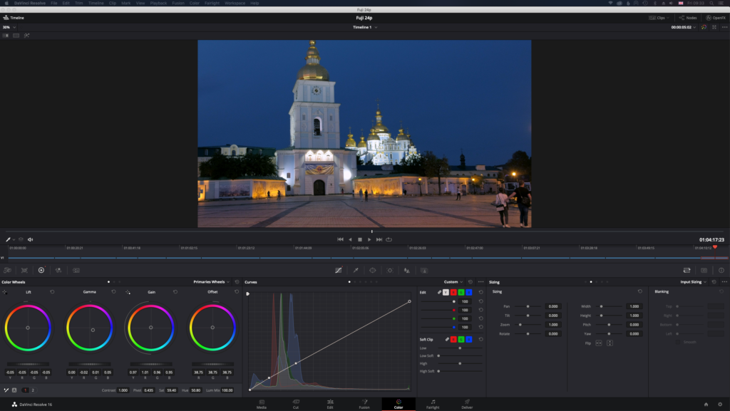
Color correction is used exactly as its name suggests, to correct, remove or enhance a cast within a photo. Most commonly, in Lightroom, we would use a combination of RAW files and the White Balance and HSL controls to correct the color of our shots.
The primary tools that filmmakers and colorists have used over the years for color grading are color wheels. They have been an integral part of editing suites for a long time. They have not, however, been common in photographic editing apps. Until now.
What Are Color Wheels?
They are, as the name suggests, circles, inside which are colors. More specifically inside the wheel are all the colors available to edit with. This is different from all the colors of the spectrum as our computers cannot work with that many. However, as you can see in this screenshot there is still a vast number of different colors to work from.
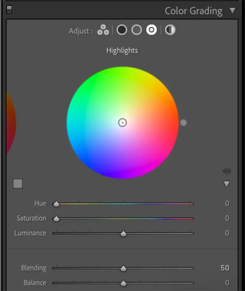
What you will also notice is how those colors are laid out. In the very center, we have white. Radiating out from the center we see all the primary and secondary colors, increasing in saturation towards the edges. The outer edges of the circle represent the maximum saturation of that color.
The other thing that you will notice is that there are, in fact, three color wheels. One represents the shadow regions of an image, one the midtones, and one the highlights. As you might imagine that gives us huge control over the way an image will look.
Lightroom’s Color Wheels
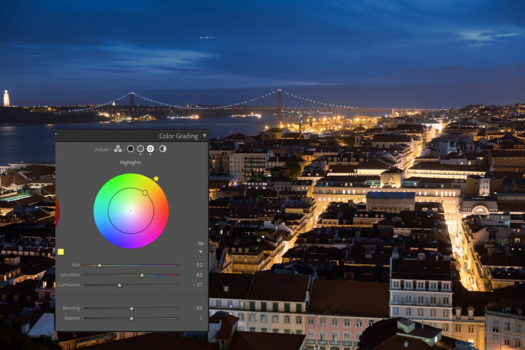
Looking in a little more detail at Lightroom’s color wheels, we can see that at the very top of the tab are five icons. The first will show all three color wheels together. The next three will show the only shadow, mid-tone, and highlight wheels individually. The last is the Global wheel. This will affect the color across all the tones of the image.
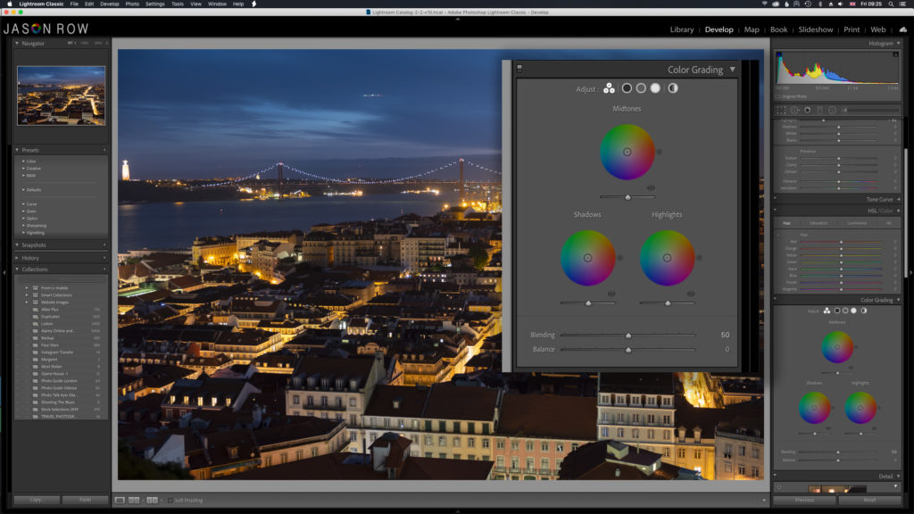
Underneath each of the wheels is a slider. This controls the luminance of the color. So for example if I pick the midtones to have more blue, sliding the luminance slider left will make those blues darker, sliding right will make them lighter.
At the bottom right of each color wheel, we see an eye icon. Clicking and holding on to that icon will remove the grade, allowing us to compare before and after. Releasing the mouse button returns us to the edit.
At the bottom of the tab, we see two further sliders, Blending, and Balance. The Blending slider controls the amount of overlap between highlights and shadows. The Balance will control the variation of color between the highlights, mids, and shadows. If, for example, I add blue to the shadows, moving the balance to the right will reduce its effect on the highlight regions. Moving the balance to the left means the highlights will be more affected by the blue tones.
Lastly, as with all Lightroom tools, we have a quick reset option by double-clicking on the word Adjust at the top of the tab.
Color Wheels In Practice
Let’s quickly edit an image using the color wheels. In this example, I am using this blue hour shot of Lisbon. I want to enhance the blues and improve the look of the lights. The image has already been corrected for color and exposure.

First I select the Midtones wheel and drag the circle towards the blues. I have done this because although the blues are dark, they are predominantly in the mid-tone regions rather than the shadows. About one-third of the way to the edge works best in this image.
Next, I go to the shadows wheel move only e luminance slider to the left. This enhances the blacks without affecting any colors. I also move the color wheel very slightly to towards the blues. This enhances the blues in the shadow regions, very subtly.
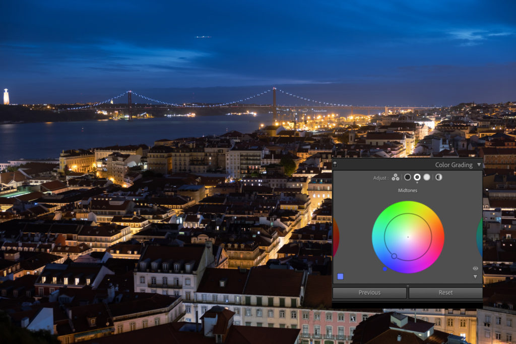
Lastly using the highlights wheel, I move the circle about one third of the way towards the yellow region. This enhances the yellows of the lights without over saturating them. As the lights are a little bright, moving the luminance slider to the left, helps reduce this.
A useful tip to note is that all the color wheel corrections will show up in the histogram at the top. It’s worth keeping an eye on this to make sure you do not push your grading too far.
Cinematic grading is often used to contrast the colors between the highlights and shadow regions. Generally, if you are pushing the shadows one color you would push the highlights toward the color directly opposite on the wheel.
In this shot, I have drastically enhanced the blue shadow regions whilst pushing the highlights towards the yellows. This gives the image a more cinematic look.
Color Grading is a welcome and powerful new addition to the Lightroom toolbox. It gives us so much more control over how we enhance colors than its predecessor, split toning.
Grading is a great way to convey mood in your image and by using the color wheels, you can experiment with your images to see how different color combinations work together to create a mood. With Lightroom’s non-destructive editing, you can play around with your images without worrying that you will ruin them.
Further Reading:
Light Stalking https://ift.tt/3pFQxhi
Sourced by Time Trap Photography sharing the best photography tips, news and tricks throughout the industry. Time Trap Photography is dedicated to freezing those special moments in life that can be revisited and admired for generations to come. - Shannon Bourque
Please visit our main site for booking availability and rates.

Receive valuable industry knowledge delivered free to your email each day.


No comments:
Post a Comment
Thank you so much for your comment. A moderator will review and approve all relevant posts. We appreciate your support and encourage you to stay with us by subscribing to our email updates. Where you can easily pick and choose what photography subjects interests you. Subscription link: http://bit.ly/photo-sub