Over the past year, photography business success came from a few unexpected sources and we spent more time fine-tuning our photography website model to take advantage of those sources. Way back in 2012, we saw a dramatic increase in mobile traffic to our web sites. Today, more then 2/3 of the Visual Wilderness traffic comes from smart phones and tablets. It comes as no surprise that Google decided to include Mobile Friendliness in its list of web page rankings.
It is more important then every to make sure that your photography business website can be accessed using a mobile device. Here are few things to consider when you are designing your website to be mobile-friendly.
#1: Use a Fully Responsive Theme
We use WordPress as a Content Management System (CMS) for our site. With this, we had a couple of options. We could convert our sites to a fully responsive theme that automatically adjusts to various screen sizes – or we could use a plug-in like WP-Touch to provide a better look and feel for our existing non-responsive theme.
After much research, we decide to go with a fully-responsive theme. Why? Using a fully-responsive theme means that we didn’t have to deal with incompatibilities between the plugins and the themes we chose to use. It also meant that our maintenance was streamlined. Instead of dealing one at a time with individual components of each site, we could configure the responsive theme itself. The choices we made during the configuration process would carry over to all elements within the site.
#2: Readable Nature Photography Blog
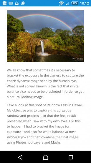
The most important content on our websites is the blog. We put up blog posts on a regular basis. These posts provide educational content for our viewers and provide information and announcements for our e-books, workshops, webinars, and events. So readability is critical – and we want our blog to be easy to read no matter what device you are using. Our new blog design is readable on any device – from a small mobile phone screen to a 30” monitor.
#3: Organized Nature Photography Blog & Gallery
This was our biggest challenge in dealing with the responsive theme back in 2012. At that time, gallery plugins and blog layout on the market were responsive but not always organized. Additional some of the blog layouts left a lot of white space as the screen size changes.
We looked for inspiration from social media sites like Faceboo, Google+, Twitter and Pinterest and decided to organize our own nature photography blog layout. We wanted a responsive and scaleable layout design that would shift and change to fit any screen size, use very little white space, work across multiple browsers, and show thumbnails without cropping. Pretty cool, right?! We use this design to display our blog article and showcase our image in galleries.
#4: Mobile Friendly Lightbox
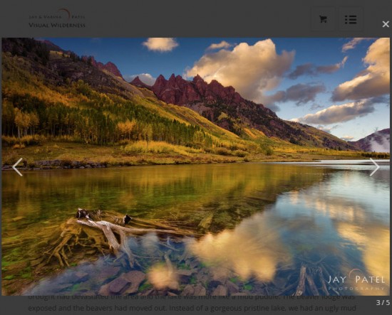
Although many light box and slideshow plugins work well enough on mobile devices, not all support the touch functionality that makes touch-based mobile devices user-friendly. We chose a light box and slideshow that was touch-friendly, worked on both desktop computers and mobile devices, and was compatible with our gallery layout.
With the responsive theme, our site is scaleable to any screen size. How can you tell if your website is mobile-friendly? You can use this tool to determine the mobile-friendliness of your site: Mobile Friendly Site Test
It is important to realize that the customer experience on your photography website goes beyond look and feel. This is specially true if you are doing business or selling products on your site. Here are a few things we have done to improve photography business customer’s experience on Visual Wilderness website.
#5: Improved Navigation Experience
Traditional websites rely on the menus for navigation. For mobile websites, these menus collapse into a single button. This means that users must click multiple buttons to navigate to a particular page or topic. Therefore, Visual Wilderness photography website provides a quick single-click navigation menu on the most popular pages making the navigation to our website incredibly easy.
#6: Mobile Friendly Online Video Tutorials
As the trend towards mobile devices continues to grow, we are getting more requests from our customers to consume our educational content on their mobile devices. To make our products mobile-friendly, we offer both download and streaming options for all of our video courses.
This streaming option provides access to ALL video courses on Visual Wilderness on any device (smart phones, tablets, laptops, and desktops) without having to download several gigabytes of files.
#7: Full HTTPS Photography Website
HTTPS is the secure version of HTTP protocol. The S at the end of HTTPS stands for Secure. This means that communications between your browser and the website are encrypted. Google gives priority to the secure website over non-secure websites in search rankings. Moreover, HTTPS sites are also used for credit card payments which makes it dramatically easier for mobile users to purchase products from our website.
#8: Web Push Notifications for Nature Photography Blog Articles
Web push notifications are emerging technology that allows website like Visual Wilderness to send out push notifications to subscribers using web browsers.
For example, this technology prompts users to subscribe to notifications automatically when they visit the website. Then, these notifications go directly to users mobile and desktop devices. By using this technology, we are able to send notifications for new blog posts as well as for any promotion we are running. In addition, a major advantage of this technology is that we can reach mobile users directly without having to open an email client or being hindered by algorithm changes on social media.
#9: Accept Payments via Apple Pay and Google Pay
It is hard to fill out all the checkout fields to complete an order on your mobile phone… and even on your tablet. By accepting Apple and Google Pay, our customers are able to complete the purchase with a single click. To note, this is an emerging technology which does not support all configurations. However, it is a technology that is likely to accelerate our mobile orders.
Have you implemented any of these or other technologies on our photography websites to improve the mobile customer experience? Feel free to share you ideas in the comments below.
Visual Wilderness https://ift.tt/30lLPfq
Sourced by Time Trap Photography sharing the best photography tips, news and tricks throughout the industry. Time Trap Photography is dedicated to freezing those special moments in life that can be revisited and admired for generations to come. - Shannon Bourque
Please visit our main site for booking availability and rates.

Receive valuable industry knowledge delivered free to your email each day.


No comments:
Post a Comment
Thank you so much for your comment. A moderator will review and approve all relevant posts. We appreciate your support and encourage you to stay with us by subscribing to our email updates. Where you can easily pick and choose what photography subjects interests you. Subscription link: http://bit.ly/photo-sub